Portfolio.
My Work
HTML/CSS/JS/PHP
Nascent-Designs
Visit This Site >>HTML, CSS, JS, PHP, SQL. So many acronyms. The web is built on these languages. Understanding how they work and interact with one another is crucial to building sites with efficiency and with the right functionality.
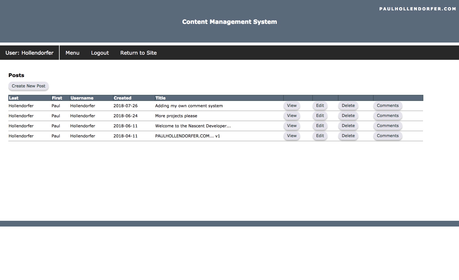
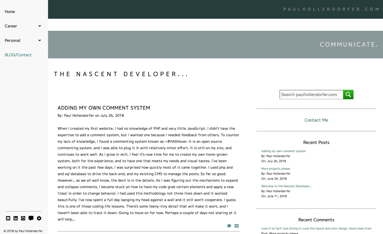
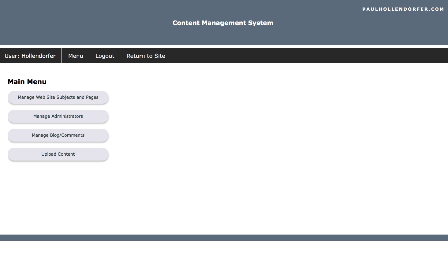
This web site is built entirely "by hand" using only a text editor. It's built upon the same structure as my personal website, paulhollendorfer.com. The pages here are driven from a home-grown CMS (Content Management System) using PHP and SQL. On the back-end (server side) there is a database which contains all of the subject and page descriptions, as well as the page content itself. There are a set of administration pages that allow the user to create, edit, and delete any of the subjects, pages, or administrative users. Subjects and Pages can be made visible (or not), and their order can be specified. Management of the comment system and a utility for uploading content to the site are also included.
On the front-end (client side) the menu structure is built on the fly by querying the database for subject and page information. When a particular link is clicked, another query is made to get the page content, which is loaded into a common framework page.
Academy District 20 Public Schools
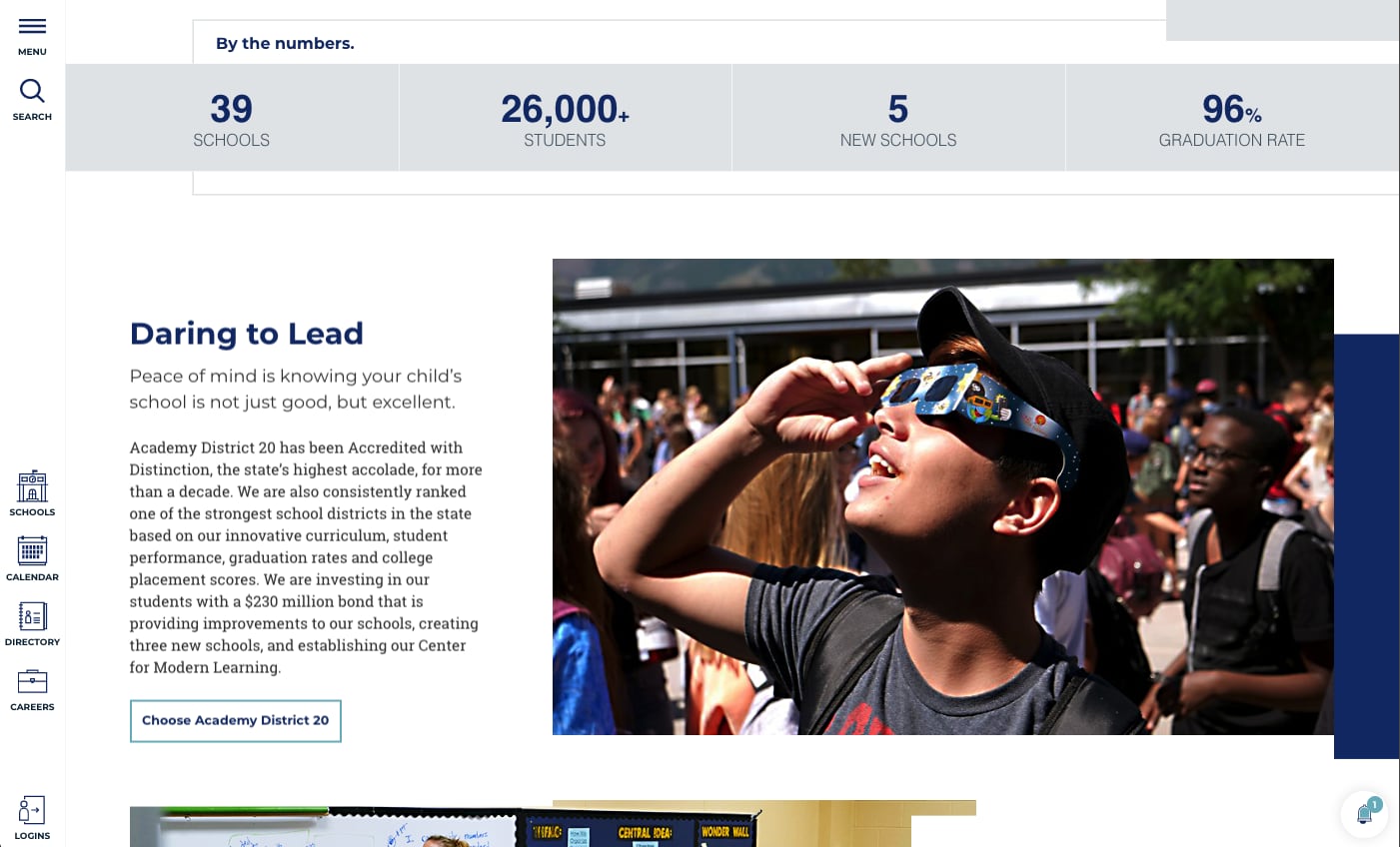
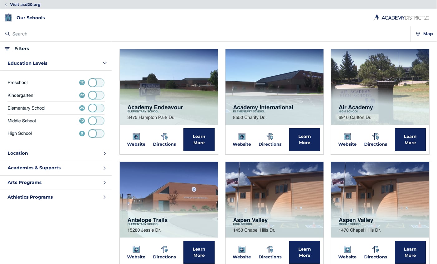
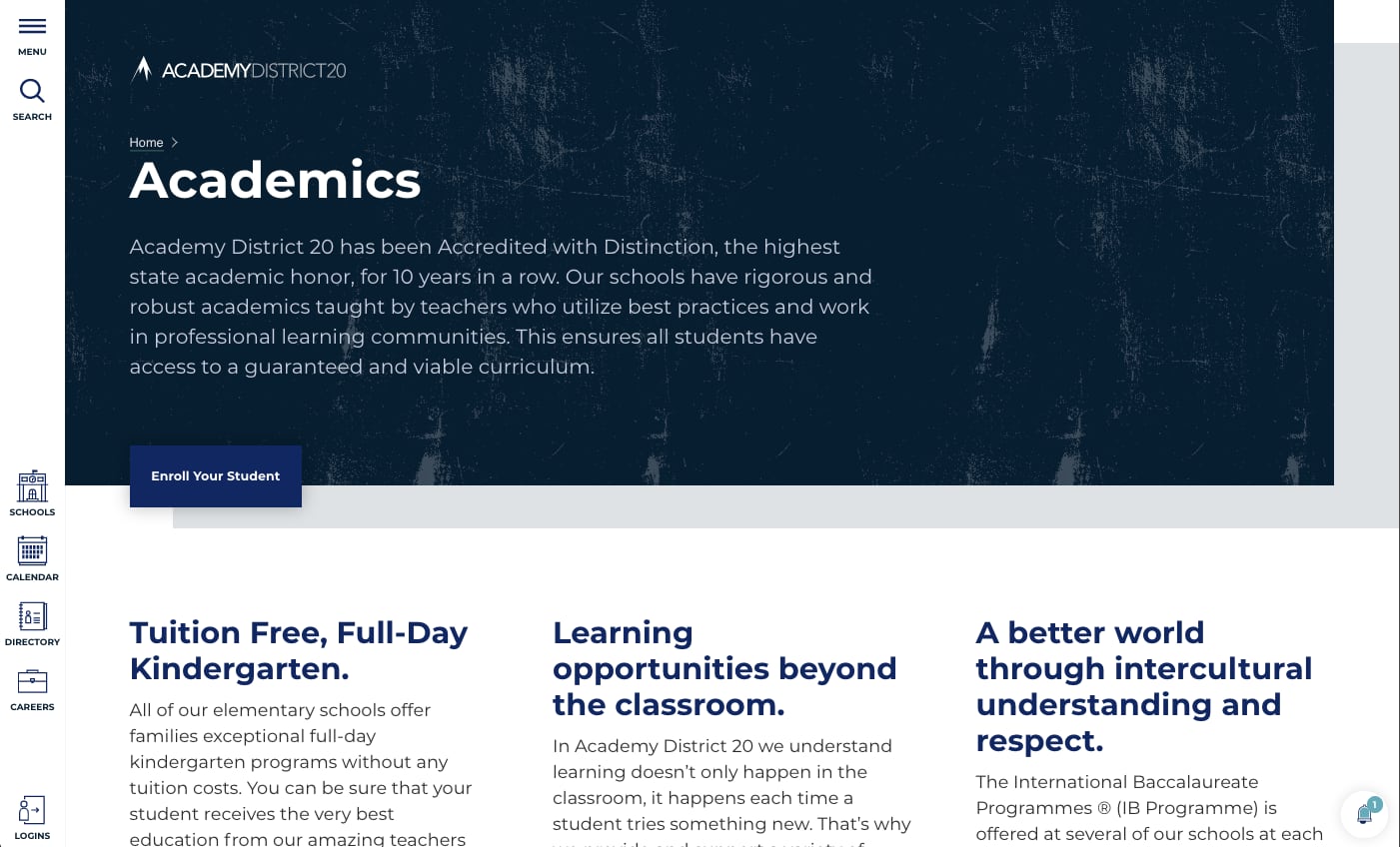
Visit This Site >>Academy District 20 is the largest public school district in the Colorado Springs area. They serve approximately 25,000 students, and have nearly 40 schools. The district's old website used Microsoft Sharepoint as the backbone of their websites. The old philosophy was to deploy the tool to all their various departments, expecting them to create and manage all related content. What resulted was a jumble of over 1,500 pages containing outdated, redundant, and inaccurate information, which was unhelpful to parents and families trying to get information on policy, calendars, forms, and so on.
I worked daily with the web developers on the Commuciations Team for almost a year to develop the main district site, which will serve as a template for the almost 40 individual school sites to follow. The site and the CMS are completely custom, and uses "mobile first" design. Vue.js was used to produce data driven components that could be reused throughout the site. Girdsome was used to generate static html pages, decreasing load times and increasing security. Microsoft Azure services was used as our backend to store data, functions, and provide search fucntionality.
The result is a site that puts the visitors needs first. Families in a public school system are not on this site to browse. They have a specific tasks to accomplish, such as figuring out the enrollment process, finding an event, or a teacher's contact information. On the maintenance side, D20 departments are removed from the design of websites and pages and can now focus on content that is relevant and accurate.
WordPress
Blue Sun Enterprises
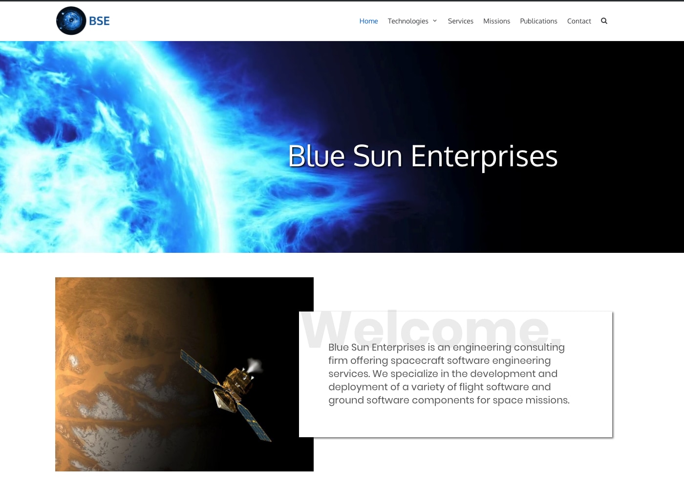
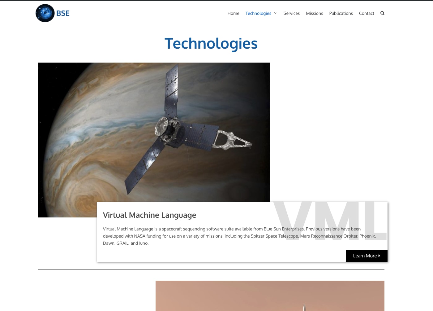
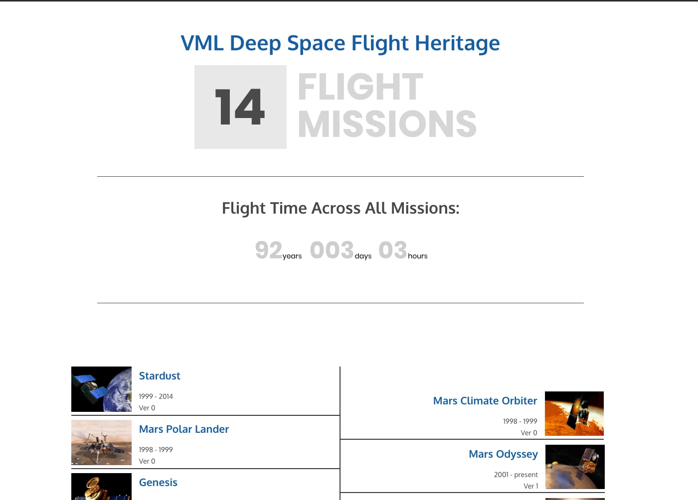
Visit This Site >>Blue Sun Enterprises is the home of a software developer who creates code for spacecraft flight operations. This project held keen interest for me as I have an avid interest in space exploration.
While there was previous content for this site, the objective here was to present it in a much more modern format and emphasize certain key technologies. The site is aimed at highly technical professionals with a background in space flight operations. In addition to the technical content, the imagery needed to portray not only previous flight experiences, but the promise of future missions.
As the owner continues to develop these technologies, it was prudent to think of future capabilites that users might want or need, such as online documentation for software and the ability to download software and other documentation.
Athena Capital Management
Visit This Site >>Athena Capital Management is a personal and institutional investment website. The owner has been in business for a number of years, and the original pages were constructed using older technologies and had some odd add-ins, such as a stand alone WordPress blog.
The first task was simply to recreate existing content in a new WordPress site. Existing financial articles and quarterly reports that existed as PDF files were converted into a blog so that the content was readily accessible and searchable. The new visuals and layout sparked a number of ideas regarding imagery, content, and structure. Most of the imagery on this site is custom. Basic elements were combined over multiple images to deliver a high-tech feel and add consistency from page to page.
Also of importance to the client, was the introduction of some basic SEO tactics.
Bluebird Metals
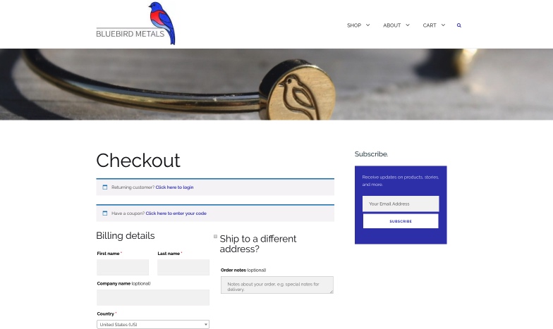
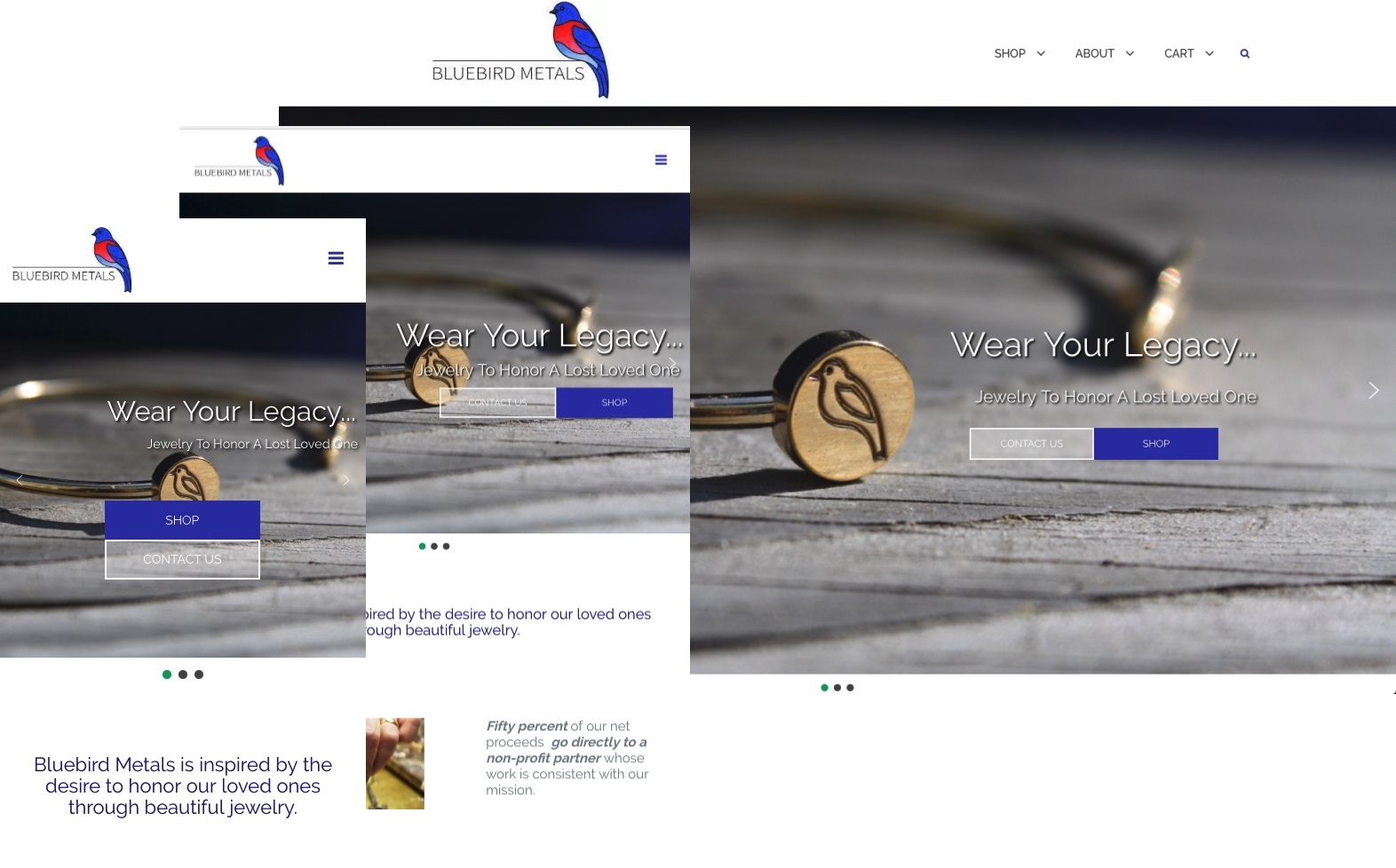
Visit This Site >>Bluebird Metals is a startup jewelry eCommerce site. The owner designs and markets jewelry used primarily as a reminder of lost loved ones. A significant portion of the product proceeds goes to a non-profit organization that helps those going through grief and loss.
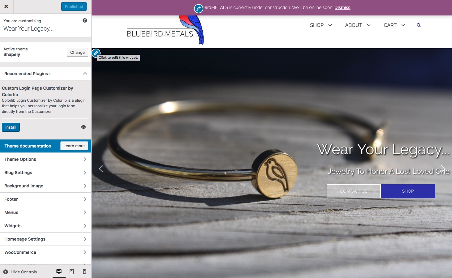
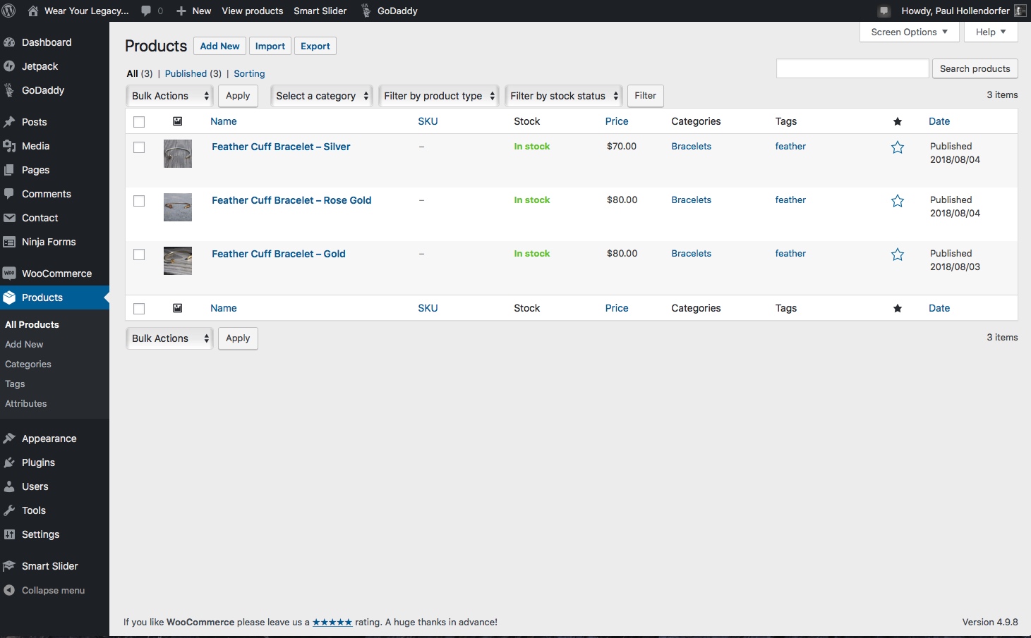
The owner had some existing assets at inception, such as the domain and a hosting service already setup. WordPress seemed like the ideal choice as the client wanted to be able to easily maintain the site after design and launch were completed, and also wanted an easy way of taking multiple payment options that could be linked to shipping assistance.
I am a strong proponent of ideation through iteration. The owner and I would regularly prototype various layouts and imagery allowing the iteration process to drive us to a site design that was clean, functional, and met her desires for showcasing the product.
WordPress is amazingly powerful. There are a myriad of templates and plugins to give virtually any functionality the designer might need. There are a few caveats, though. The sheer number of templates and plug-ins is daunting, and finding the right one that is also high quality can sometimes be a challenge.
Squarespace
George Bodde Fine Art
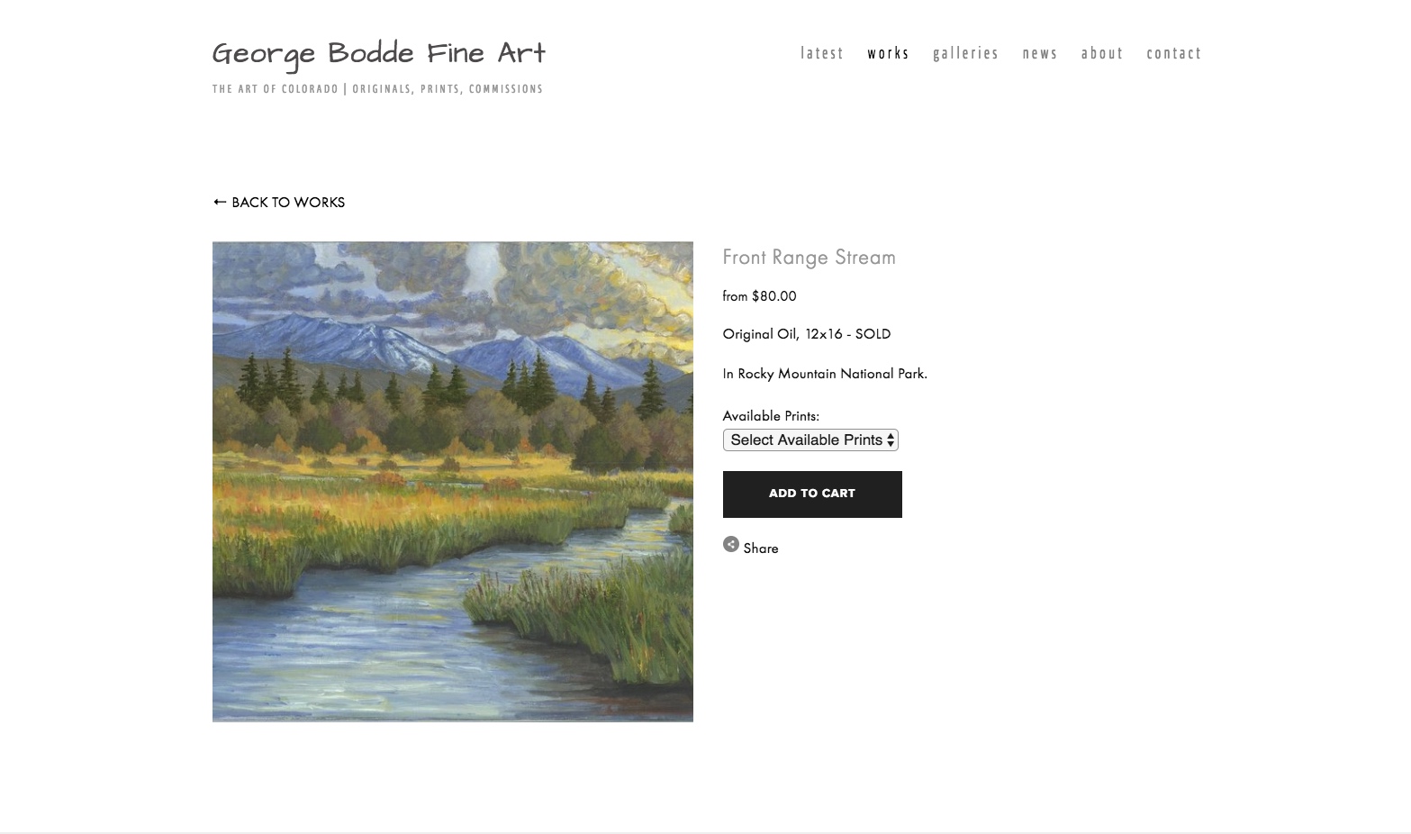
Visit This Site >>A good friend recently retired from his career to pursue two life-long passions, fishing and painting. He decided to make a business out of being an artist, and asked that I help him set up a site though which he could market and sell his paintings. Some of his works are located in galleries, so it was important to develop a way to show all of his works, while respecting the sales pathway for those pieces in a gallery. The solution here allows the customer to browse all of George's work, and directs them appropriately when a piece is not available online.
Squarespace was a good choice for George. He had already created an initial site just to show off his work, so he was already familiar with the interface. Additionally, it's likely he'll be performing the site upkeep in the future, so keeping him on a familiar platform was important. He also wanted a more professional look and eCommerce functionality.
Because Squarespace is template driven, the designer is constrained by the elements offered in the template, significantly limiting customization. That said, the templates offered by Squarespace are well thought-out and executed, making most of their sites professional looking and consistent in performance. While I prefer the flexibility of a custom built site, Squarespace is extraordinarily easy to use, and is not as quirky to set up and use as WordPress.
Responsive Design
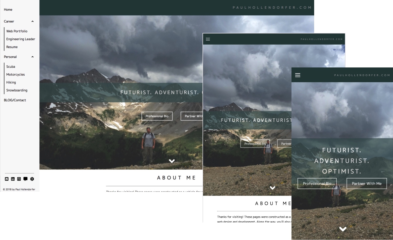
It's been true for some time now that a majority of web site visits are from mobile devices. How many times have you looked up something on your phone's browser, or made a website purchase on your tablet? The point being, a website that is responsive to whatever device is being used is not a feature. It's an expectation.
The languages and tools of web development have quickly adapted to the web on mobile. There's simply no excuse for a website to have poor aesthetics or functionality just because its being viewed on a small device. Tools like a responsive grid design, flexboxes, media queries, and so on let your website look good on any device.
All of my projects to date have had responsive design (sometimes known as a "mobile first" philosophy.) Page design starts, by default, with the expectation that the site will be viewed on a mobile device. While larger desktop browsers can provide more features, such as animations, parallax effects, and so on, those are added after a good mobile layout is designed.
Content Management
A key element of web design is understanding how the site will be maintained. It's tempting to think that once the design is complete and launched that it's somehow self-maintaining. If it's a blog, how do you add new posts? If it's a store, how do you take orders, update products and inventory, and communicate with customers? Will the owner of the site do this maintenance? How skilled is this person at these tasks?
Simple websites with static HTML pages, which convey only information (like a resume, or How To page), might not need much upkeep. On a blog site however, a CMS (Content Management System) would simplify the creation and modification of posts and comments. A start-up company may start with a vanity site, but migrate to eCommerce or other functionality. In such cases, a CMS would help in adding and maintaining functionality. Content management via WordPress, Wix, or Squarespace offer the potential of tremendous functionality with a comparatively small investment in user time to understand and use the tool. These are very complex CMS systems, often lumped into the category of Web Site Builders.
This site has a CMS made with PHP underpinning it. You could argue that this is overkill for a resume/about site like this. I use it because it helps me learn and maintain my PHP skills. Hovever, it would be ideal for running a small blog site, as the comment system allows the owner to easily manage communication with visitors. The downside is that it requires skilled intervention if there's a change in functionality.
Content Management in the form of WordPress, Wix, or Squarespace allows the user to add very complex functionality, like widgets, eCommerce, blog, and more. These systems also have the advantage that many of these plug-ins are intensely tested by companies who have a vested interest in providing a good quality feature (credit card payments are a prime example.)
Ultimately, a thorough understanding of the owner and site goals will drive the decision as to how to configure and run the site.
eCommerce
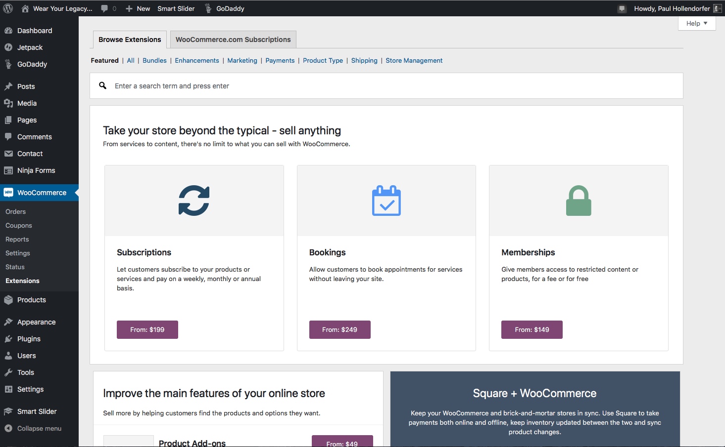
My exposure to eCommerce thus far has been through the WooCommerce plug-in for WordPress and the store functionality built into Squarespace. There are a number of reasons why I haven't delved into this subject from a custom coding perspective. More on that below.
Both WordPress and Squarespace offer online store functionality. Features include: product and inventory setup, credit card payments, shipping labels, customer communications, email promotions and discounts, and analytics. There are many more features.
WordPress offers a staggering number of plug-ins for these features. Basic functionality is often at no cost, but more advanced features are not free. High flexibility comes at the potential cost of poor interactivity with other templates or plug-ins. There is a community rating system for WordPress plug-ins and this can help in choosing the right set of plug-ins that play well with the rest of the site.
Squrarespace is more of an all-in-one solution. All of the basic functionality can be added to virtually any Squarespace site, it's just a matter of plugging in the products and related information. However, Squarespace tends to be a bit more expensive because you get the entire feature set for any site you build.
Hand coding this type of functionality may pose some additional risk. The functionality offered by WordPress and Squarespace (and others) is highly tested from both a code validation and actual use perspective. The companies offering these plug-ins have high motivation to ensure these features work and are secure (you are paying them for each transaction). It's highly unlikely that any custom code could match the level of both functionality and security that these products offer, hence my reluctance to set up an online store in this way.
A word about security. The use of SSL (Secure Socket Layers) is a foregone conclusion when setting up an online store. SSL allows the browser to communicate critical customer information securely. We are repeatedly told (and rightfully so) not to order from a website when the browser doesn't show the lock icon in the address bar. SSL provides this security and peace of mind to a customer when ordering online. Security requirements and expectations will only grow in the future, especially when data exchange occurs.
Discovery
You need a website. Why?
The answer to that question may seem very straight forward and obvious:
- I want to write about or share something.
- I want to sell something.
- I want to have my resume online.
Without diving deeply into this question, you may wind up with a site that doesn't deliver what you want, or that takes a lot more effort to maintain than you thought. Regardless of the reason, your website is a reflection of you, your products, your skills. If you don't set expectations for yourself, your site, and your developer, how can this endeavor possibly succeed?
Discovery is a process between you and your developer. It should be open and honest. The developer has to know what you want in order to deliver a product that matches. You need to know what your developer's capabilities are and have confidence that your going to get what you asked for.
Here are some thoughts on Discovery:
- Your background. What led you to wanting an online presence?
- What are your goals for the site?
- Who is your audience?
- Have you thought about what it takes to maintain the site? If you're blogging, how often will you post? If you're selling something, who will enter new inventory, print shipping labels, and talk to the dissatisfied customer?
- Do you have examples of websites you like? Why do you like them?
- When do you need to go live?
- What assets already exist? Imagery? Example work? Descriptions? Bios? An existing website? A domain?
- What is your budget? For design? For ongoing maintenance?
- Do you want to be trained to make changes after design is complete?
- Does the developer have a process for this?
- Can the developer demonstrate capability? Is there previous work to show this?
This process can be half an hour, or last several days. Let it. By knowing what you want and why, you'll have a way to measure success when you're done!
Iteration
You've just started working with a developer on your new site. It's been several days, and you're presented with an initial mock up. You hate it.
One of the funnest parts of being a developer is learning and trying new things. Nothing is set in stone. You should expect to communicate frankly and often with your developer. Changes are made. New ideas form. More changes are made. You like this part but not that.
As a developer, I expect my client to change their mind frequently. Things you tried and didn't like, you may go back to. You might get half way done and need to start completely over. The steady flow of communication helps both the developer and the client better understand where to go.
If your developer expects you to know exactly what you want at the beginning of the process, you need to find another developer. Ideas beget ideas. Make that process work for you.

Launch
You're ready to go. Your site is up. The world can see.
Launching your website is a great milestone. It's also the right time to take another look at the Discovery process and make sure your site reflects you and the goals you set. There will be fine tuning. More iteration.
There are a number of things to wrap up:
- Are you going to self-maintain? If so, do you need any training?
- Whether you have a WordPress site, or a custom site, there will be updates. Templates and Plug-ins for WordPress are frequently updated. Server software will be revised. HTML, CSS, JavaScript are all in constant development. How will you become aware of these changes and keep your site humming smoothly?
- If you're blogging, can you maintain the addition of new content? How many times have you visited a web blog, and the last post is 3 years old? Perhaps you need to adjust to a quarterly update. Say so on your site to set some expectations. Or maybe you decide not to blog at all.
- Domain names typically expire. Do you know how to renew?
- You allow comments on your Products or Posts. It's filling up with spam. Do you know why and what to do about it?
The list above is not meant to scare you into a long term contact with a developer. In fact, my current clients are self-maintaining. Educating yourself on these topics will allow you to make better choices about how to maintain your site, and keep you and your site in front of the world with minimal fuss.
Let me know how I can help!
